Corporate Design
Teunen Konzepte
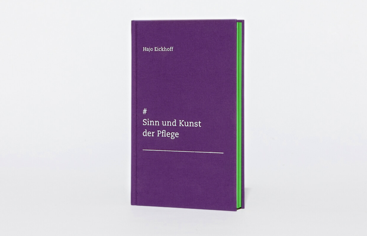
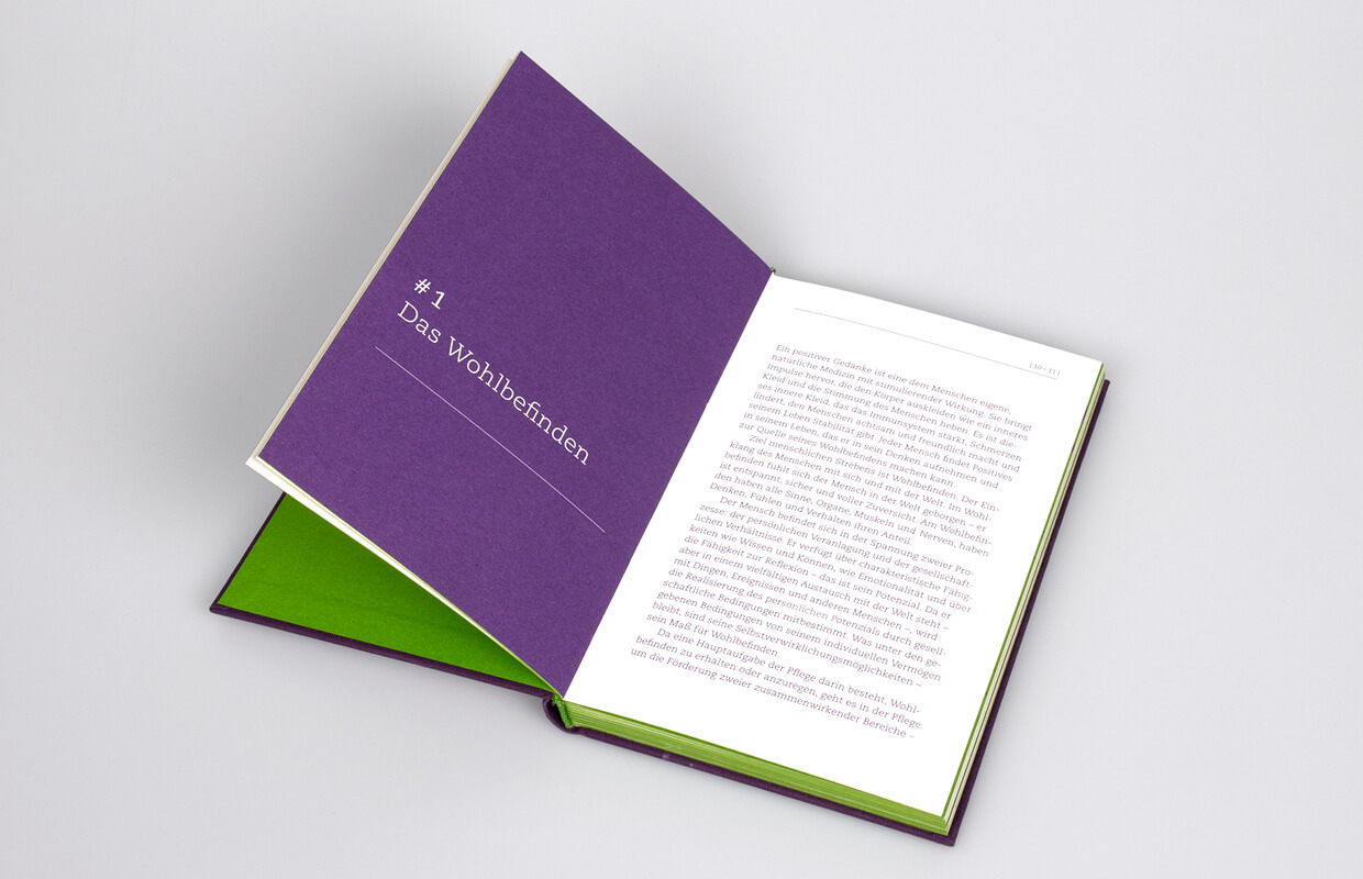
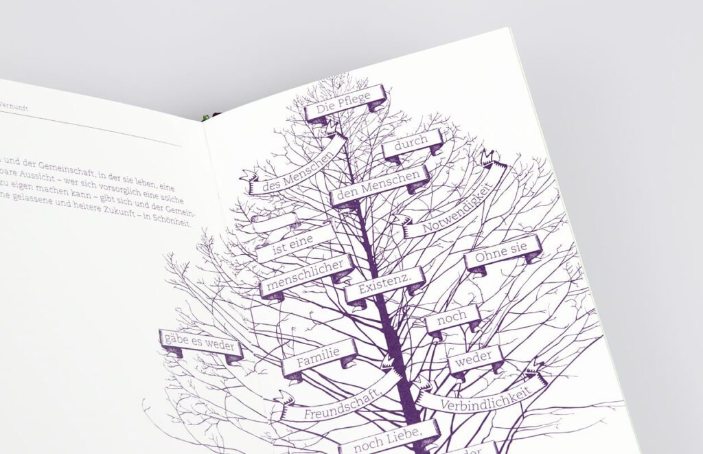
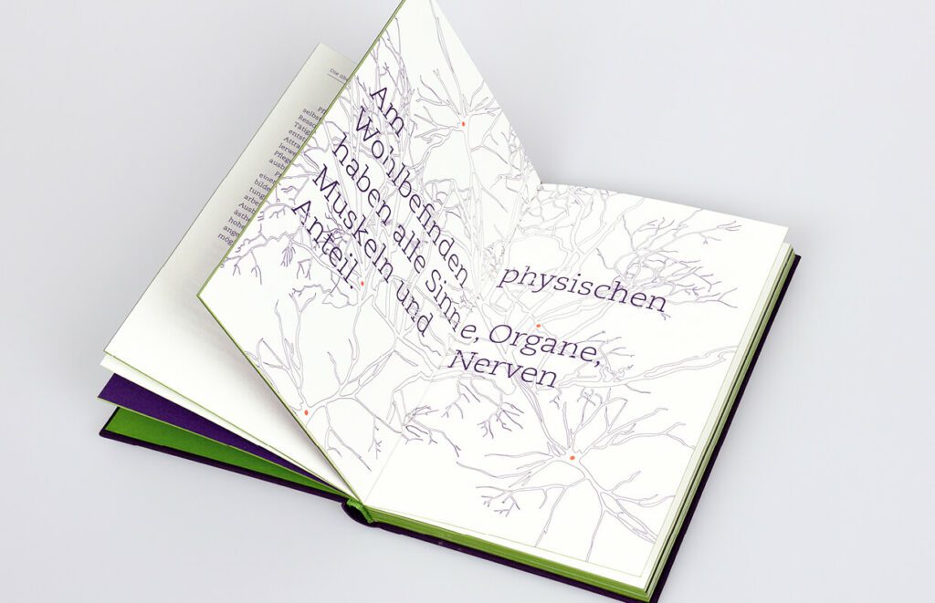
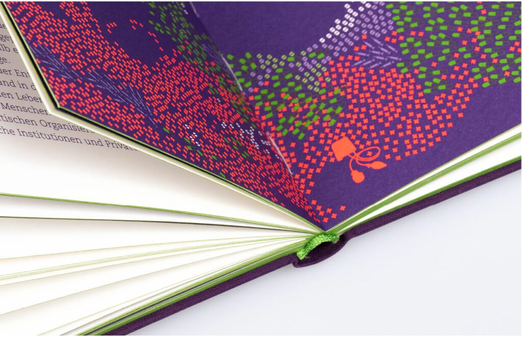
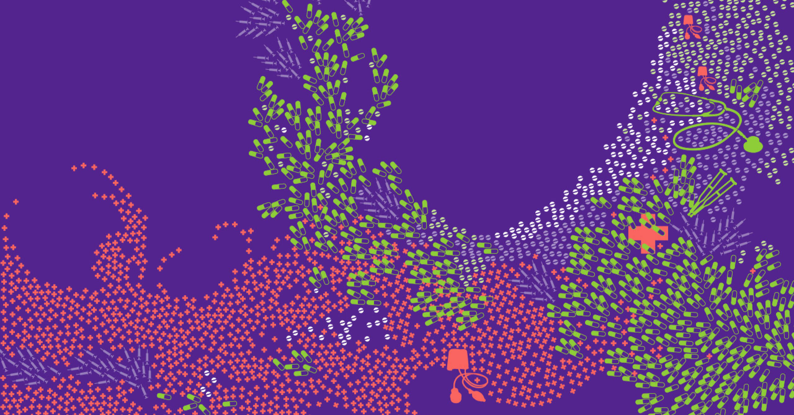
Minimalist, emotional and subtle. For Teunen Konzepte, we were responsible for the brand identity from conception to rollout. Teunen Konzepte sees itself as a cultural capital producer that develops concepts for companies that contribute to the development of a sustainable corporate culture. The central design element was the »T« derived from the name. The logo has the special feature of existing in different types – Sans Serif & Antiqua. The individual form quality of the letter combined with minimalist use is so concise that the appearance functions stringently. The appearance is supported by the brand colors purple as the primary color and grass green as the secondary color. The strong use of color gives the minimalist appearance an emotional appeal. The rollout included various means of communication, from business stationery and the website to the image brochure and publication. For the print products, the focus was on a subtle materiality and design. The classic letter thus comes in a transparent envelope and the image brochure was produced in a stylish and minimalist style with gray cardboard and a high-contrast cloth binding.