REDESIGN SELF-LEARNING SERIES
Hueber Verlag
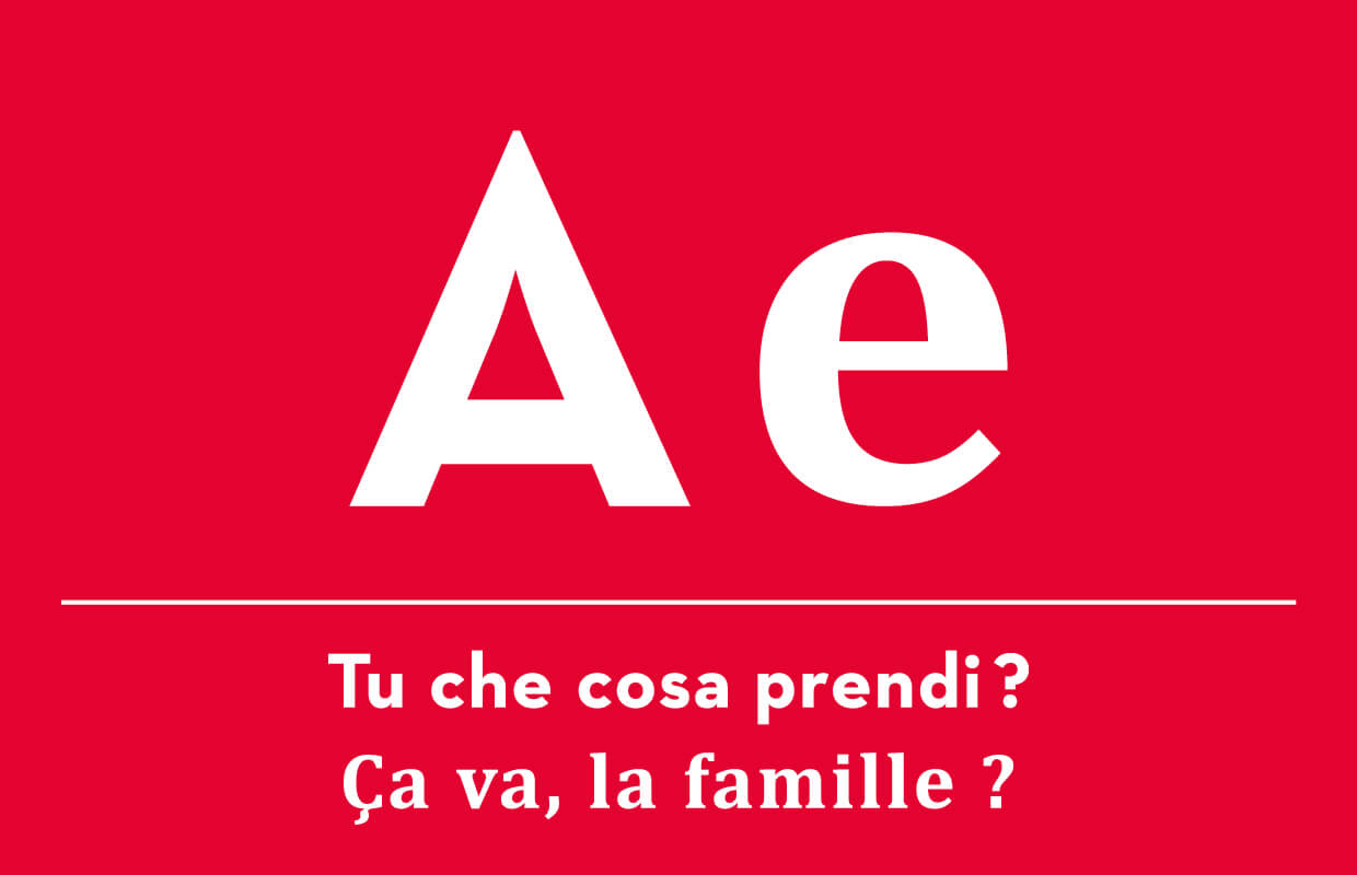
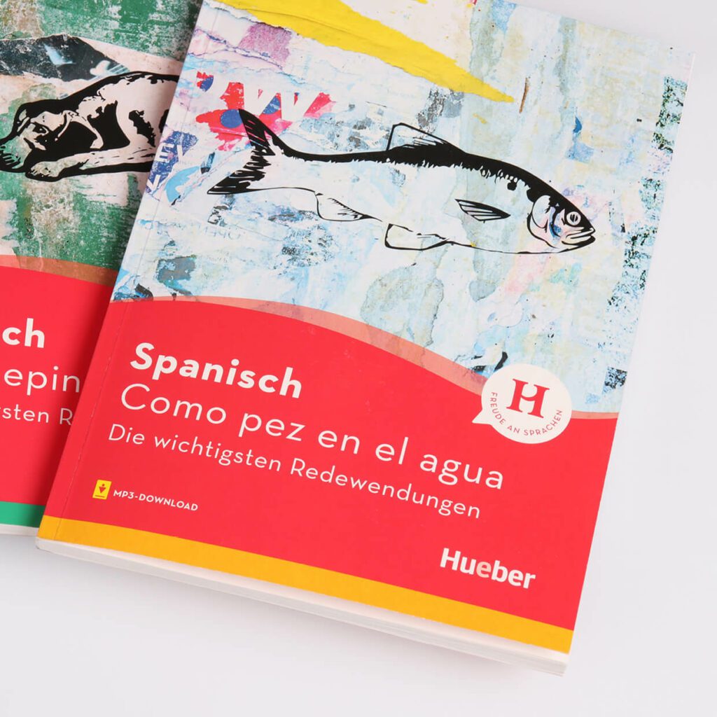
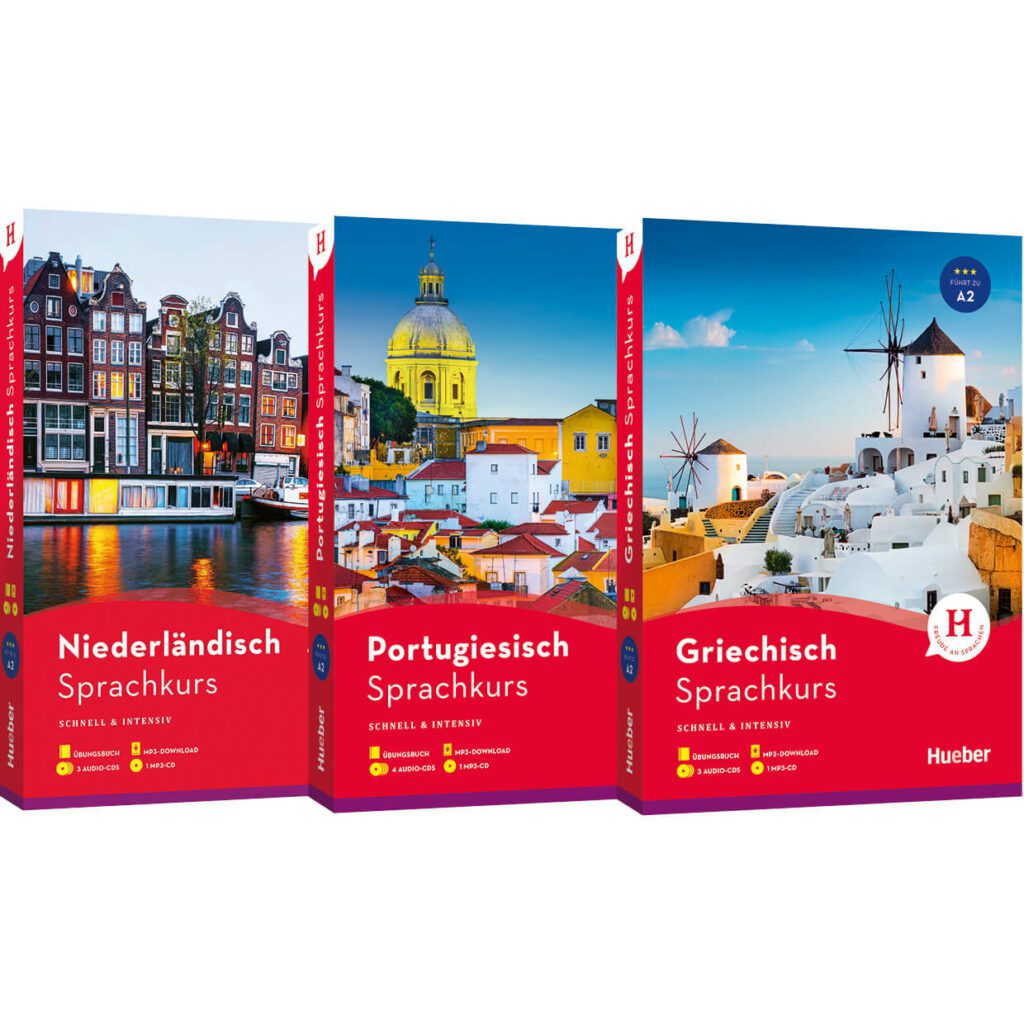
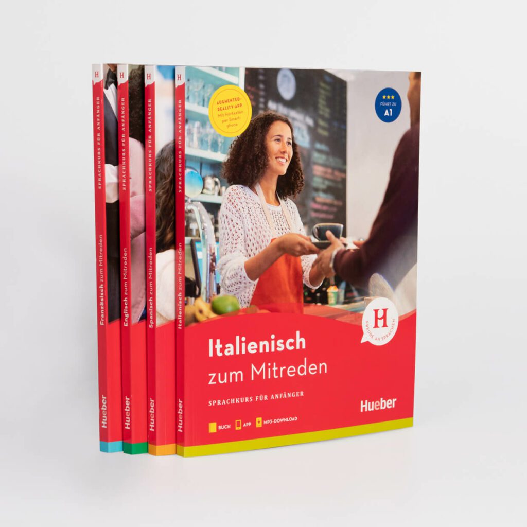
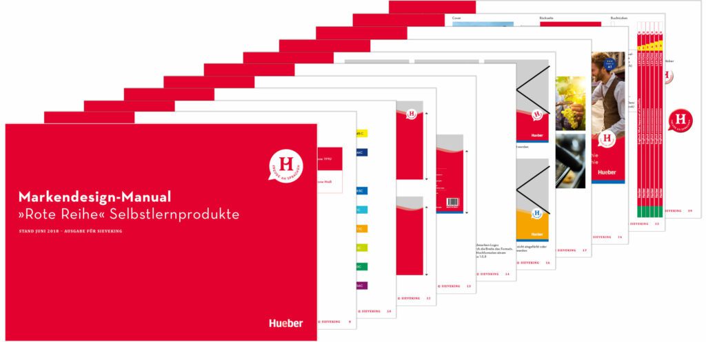
We gave the popular self-study series from Hueber Verlag a uniform and contemporary overhaul of its entire appearance. Both for the self-study area »German as a foreign language« and for the entire »foreign languages« area. The aim of the relaunch was to strengthen the product brand, make the high quality standards visible and convey a desire for language. The new brand design we introduced is based on a uniform packaging design for various product ranges with different target audiences. Based on the style guide introduced for this purpose, individual style elements such as the logo, color, font, layout and pictograms were further developed and adapted. As part of the new brand design concept for this Hueber product brand, we created a timeless logo based on the letter »H«. The traditional color red as the unique selling point of Hueber Verlag in the competitive environment is unambiguous and clear. It has been learned and was therefore retained, but slightly modified. A modern, strong shade of red replaces the old color. Not only concise learning tips and a wide range of exercises based on the latest findings in neuroeducation, but also humorous illustrations and a modern, clear and emotional visual language bring momentum to everyday learning.


